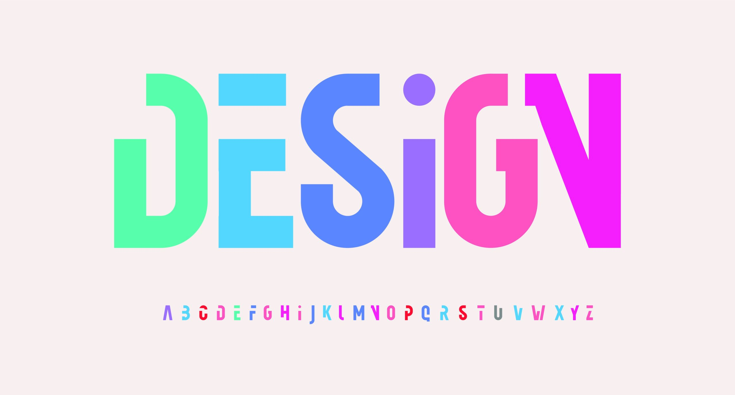
NaZMalogy - Typography is not merely about letters—it can determine the success or failure of a design. Typography is the art and technique of arranging text so that it is not only easy to read but also visually appealing. In the world of graphic design, typography includes choosing a typeface, adjusting size, kerning, leading, and the overall layout of text. The goal of typography is not just to make writing look neat, but also to convey a mood, character, and specific message to the audience. With the right typography, a design becomes more communicative, aesthetically pleasing, and visually distinctive.
Typography has two main purposes. First, to ensure the text is easy for users to read. Second, to present a visual atmosphere or aesthetic that can attract the audience’s attention. By understanding the basic principles of typography, a designer can enhance the quality of their work. Of course, this requires practice as well as fundamental knowledge. Therefore, let’s begin by exploring some of its key principles.
Difference Between Typeface and Font
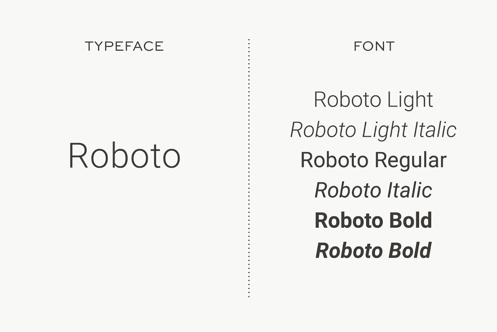
The terms typeface and font are often used interchangeably, which can be a bit confusing. A typeface is a collection of various fonts, while a font refers to a specific style or weight within a typeface family.
For example, Roboto is a typeface, but Roboto Bold is a specific font that belongs to the Roboto typeface family. The visual example below will help you better understand the difference between a typeface and a font.
Typeface Categories
In general, typefaces are divided into three main categories: serif, sans serif, and decorative or display. Every font we use typically falls into one of these three categories.
1. Serif
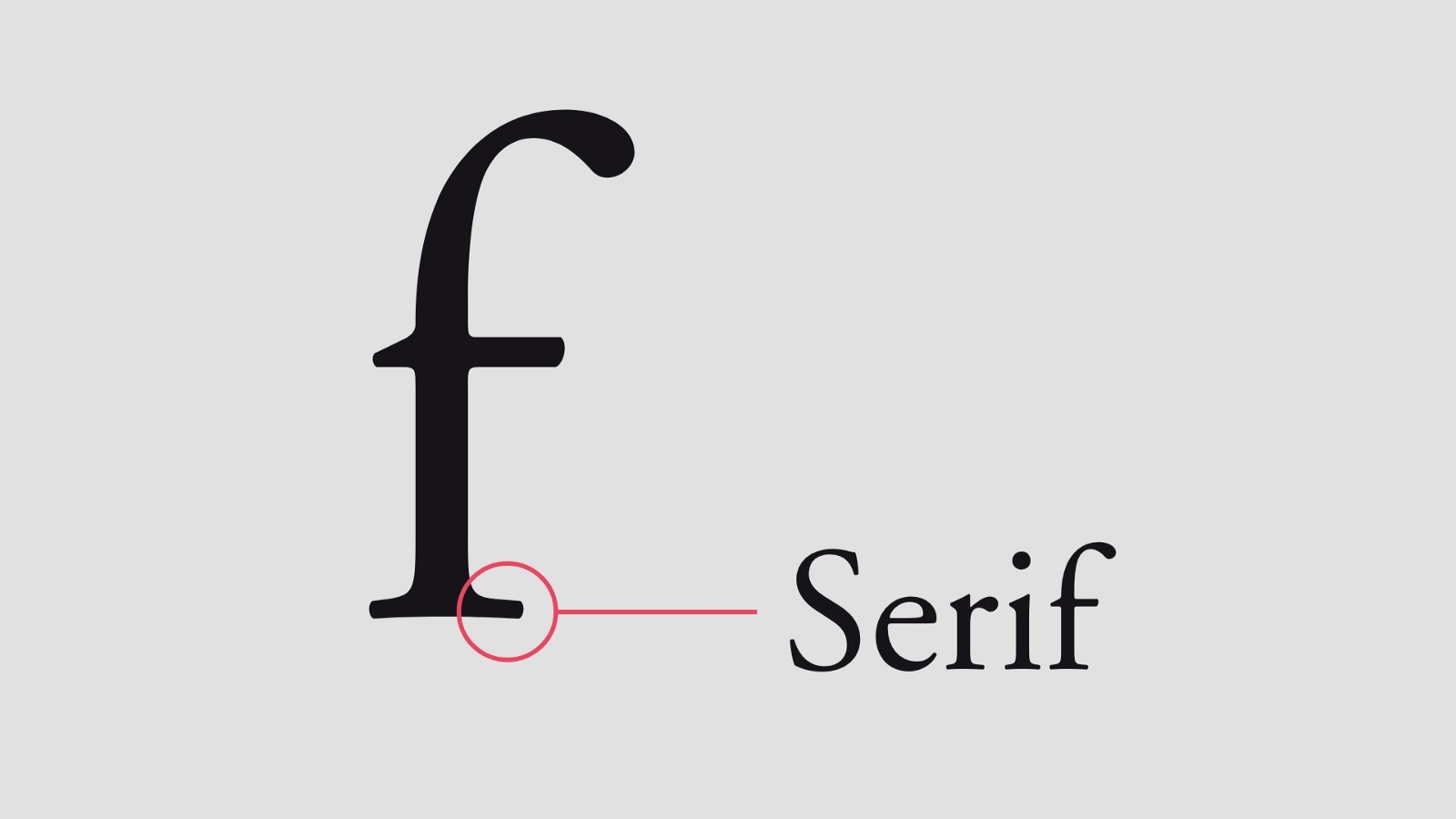
Serif typefaces are characterized by small lines or strokes attached to the ends of larger strokes in each letter. These small extensions are commonly referred to as “serifs,” often described as the “feet” found at the bottom of a character. Not all serifs look the same—each serif typeface has subtle variations that make it unique and visually distinct.
Serif typefaces convey a more formal and traditional look. They are commonly used for editorial purposes, such as in newspapers, magazines, and the main body text of books. There are many serif typefaces, and one of the most well-known examples is Times New Roman.
2. Sans Serif
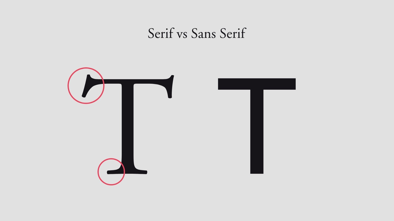
The term sans serif comes from the French word “sans,” which means “without.” Therefore, a sans serif typeface can be understood as a typeface that does not have serifs, or the small finishing strokes found at the ends of letterforms. This type of typeface is generally more modern, bold in appearance, and often suitable for large headings. One of the most popular sans serif typefaces is Arial.
3. Decorative or Display
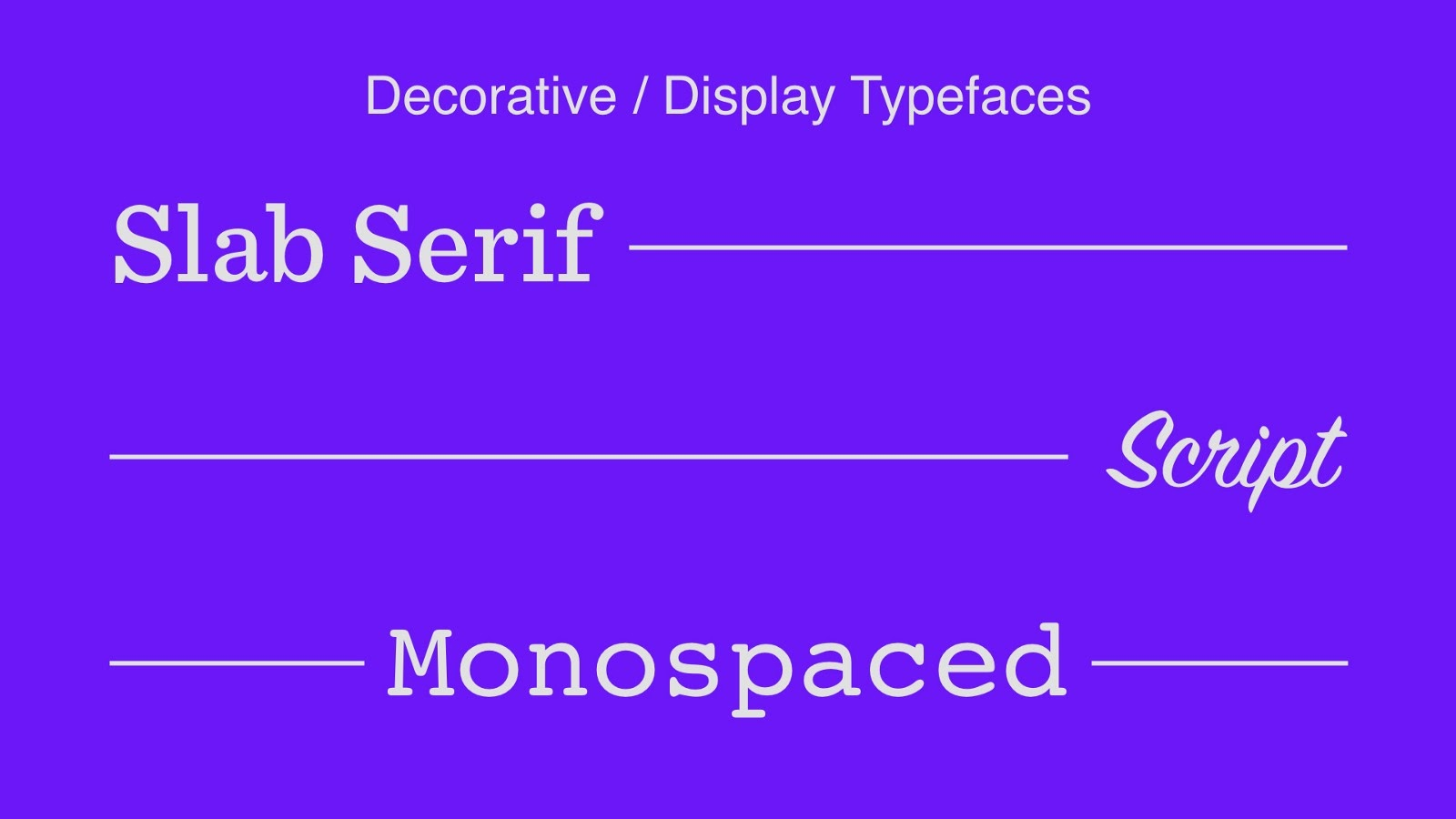
Decorative or display typefaces are designed with unique and eye-catching styles to attract attention. Unlike serif or sans serif typefaces, which are typically used for longer text, decorative fonts are more suitable for titles, logos, posters, or design elements that need to stand out.
Within this category, there are various subtypes such as slab serif, script, blackletter, monospaced, and others. Because of their expressive nature, decorative typefaces can add character and visual identity to a design, but they should be used sparingly to avoid compromising readability.
Typographic Elements
Now let's go over several core elements of typography that you need to understand, as they will be used frequently whenever you work on any design project.
Kerning
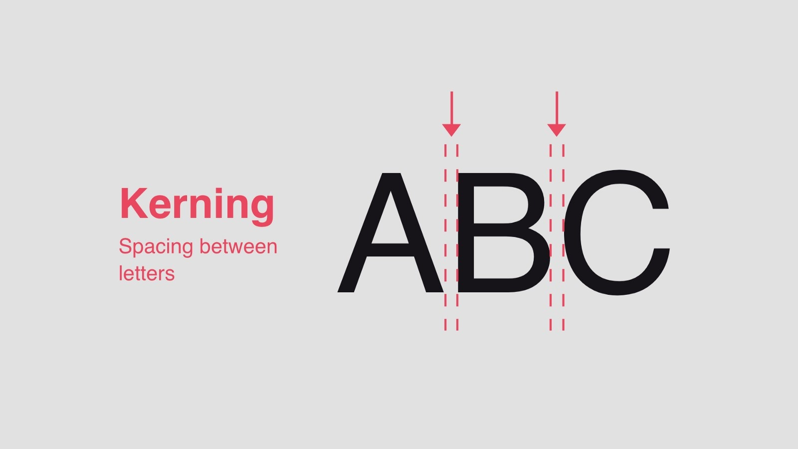
Kerning is the adjustment of spacing between individual letters in a word to make the text look balanced and easy to read. The purpose of kerning is to ensure that each letter fits well with the next—neither too tight nor too far apart. For example, when the letters “A” and “V” are placed next to each other without kerning, they may appear too far apart at the top. With kerning applied, the spacing is adjusted so the word appears cleaner, more harmonious, and visually pleasing.
Tracking
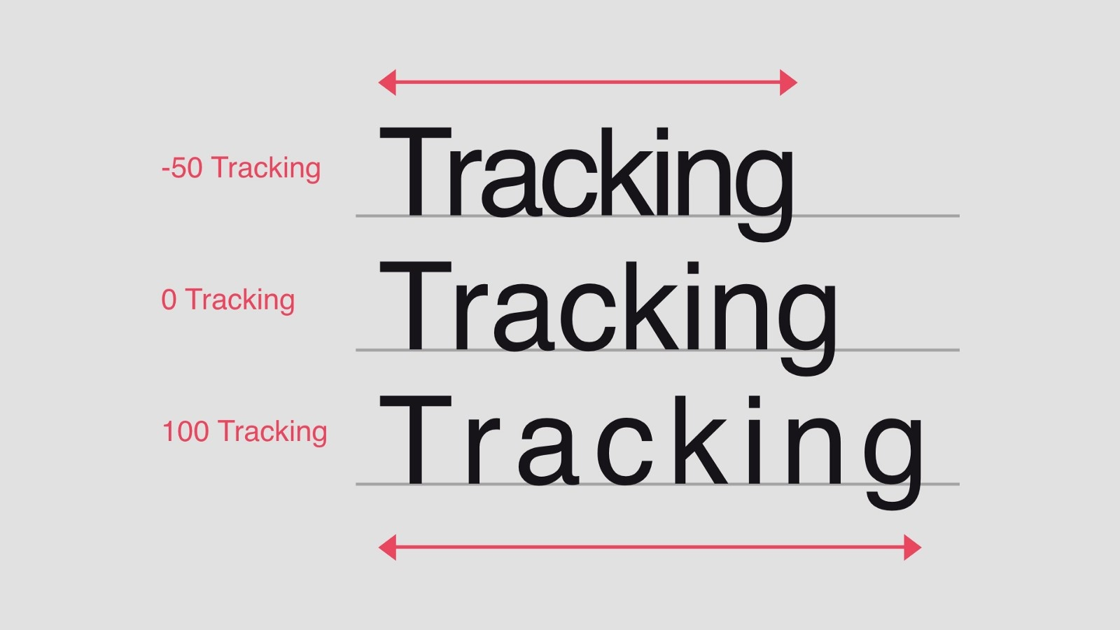
Tracking may seem similar to kerning because both involve adjusting the spacing between letters. However, they are two different techniques. While kerning adjusts the spacing between two specific letters, tracking adjusts the spacing of all letters in a word. Tracking is generally used to increase or decrease the overall spacing in a word so it appears more proportional.
Leading
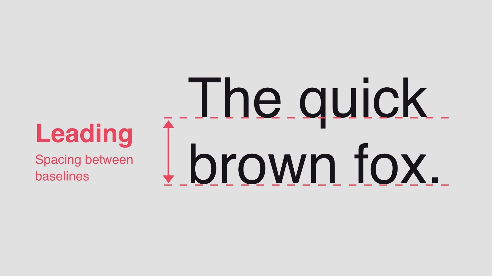
If kerning and tracking are the basic typographic techniques for adjusting horizontal spacing between letters, then leading is the technique used to adjust text vertically. Similar to kerning, leading can greatly affect the readability of text in a design. Line spacing that is too tight will make it difficult for readers to follow the sentences. The same applies if the spacing is too wide, which can also make reading more challenging.
Why Is It Important to Learn Kerning, Tracking, and Leading?
For a graphic designer, understanding kerning, tracking, and leading is essential. For example, when changing a typeface or designing a logo, knowing the differences between these three techniques can be extremely helpful in creating better letterforms and overall design. Additionally, mastering these typographic aspects can convey a strong sense of professionalism in the eyes of clients.
Tips: How to Choose a Font
After learning what typography is, the three main typeface categories, and the elements and adjustments that make text easier to read, how do you apply that knowledge to choose the right font for a design project?
1. Match the font to the purpose of the design
Every design has a different goal, so choose a font that supports the main message. For example, use an elegant font for a wedding invitation, or a bold and modern font for a technology brand.
2. Align it with the theme or brand identity
Fonts are part of a brand’s visual identity. Choose a typeface style that reflects the theme or character of the brand—whether it aims to appear formal, casual, modern, or creative.
3. Use 2–3 typefaces
Using too many fonts in one design can make it look messy. It’s best to use one font for the heading, one for the body text, and, if needed, one additional font as an accent. This keeps the design varied yet consistent and organized.
Typography is an essential element in graphic design—not only to ensure that text is easy to read but also to help build atmosphere, aesthetics, and visual identity. A designer must understand typography in order to create strong, effective designs. By mastering typography, a designer can produce work that is visually appealing while effectively communicating the intended message to the audience.
__________
Curious about more topics? Keep reading at nazmalogy.com!
Image Sources:
Design (https://rizvisual.com/wp-content/uploads/2023/05/shutterstock_1883190655-scaled.jpg)
What is typography (https://www.flux-academy.com/blog/what-is-typography)
References:
Iswanto, R. (2023). Perancangan buku ajar tipografi. Jurnal Desain Komunikasi Visual Nirmana, 23(2), 123–129. https://doi.org/10.9744/nirmana.23.2.123-129

